Spring wardrobe change: Apartmány Luka and SVUMSP get a new coat
Spring is the perfect time to air out the closet. So I aired out two websites that had worn the same coat from the same template for years. Holiday apartments in Buchlovice and an artists' association from Uherský Brod finally look the way they deserve.
Websites are a bit like clothes. When you buy them, they fit. Then a few years go by, you change, fashion changes, and one day you realise you are still wearing a jacket you outgrew long ago. It works, nobody complains, but you would rather not show it off.
That was exactly the case with two websites I have a personal connection to. Both were once built from free HTML5 UP templates, both worked, and both asked for a new coat this spring.
Apartmány Luka: from one apartment to three
Apartmány Luka are in Buchlovice, South Moravia, a short walk from the chateau, Buchlov Castle and the vineyards. A place people visit for cycling, wine and quiet.
The old website did not quite match that. It greeted you with a dark screen, a heading and a little circle, with everything else hidden below. It described a single apartment, even though three are available today. And a look at the source code revealed comments like "This is Massively", a greeting from the original template. A coat with the shop tag still attached, so to speak.
The new website is built around what guests actually want to know:
- Where is it and how do I get there. The "Navigate to us" button sits right at the top and there is a map at the bottom.
- How do I book. Bookings are phone-only, so the phone number is always in sight, one tap away on a mobile.
- Which apartment to choose. Luka 1, 2 and 3 each have their own tab with capacity, price and a photo gallery you can browse full screen.
- How much and when can I arrive. Prices and check-in and check-out times sit together in one section, no digging through paragraphs.
- What to do nearby. The chateau, Buchlov, Smraďavka, Kovozoo, Živá voda, Luhačovice spa, cycle paths. Here the surroundings matter as much as the bed.
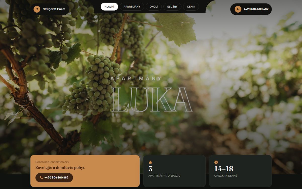
Technically it is deliberately simple: a single static page, no content management system, no plugins that need updating every month. The hero photo loads according to the screen size, so a phone does not download a huge image meant for a monitor. The site is fast, has nothing to break and the owner does not have to look after it. For accommodation with a handful of apartments, that is exactly what you want.
SVUMSP: artists deserve a gallery, not a notice board
SVUMSP is the Association of Visual Artists of the Moravian-Slovak Borderland. It has been around since 1990, is based in Uherský Brod, and over the years more than 150 professional and amateur artists have been part of it. People who spend their whole lives thinking about how things look.
Which is why it was a little ironic that their website looked like a neatly kept notice board. I built the old version myself years ago, also on an HTML5 UP template, and it served well for its time. But times moved on. The site felt plain, the artworks had no room to shine, and the texts on the home page could only be changed through me.
I built the new website around three things:
People. The home page opens with a group photo of the members. The association is not an institution, it is a group of people, and that should be visible straight away. Every artist has their own card with a portrait and portfolio, and the Artists section can be filtered.
Art. The gallery got the space it needed; photos open in a large preview and can be browsed. Everything is carried by a calm, warm palette and the classic serif typeface Playfair Display, which suits visual art better than strict technical fonts.
Independence. The association now manages most things on its own. Articles, almanacs, artists, their photos and the texts on the home page, section by section. Nobody has to wait until I have time.
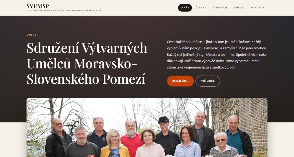
Under the hood it is still the proven PHP framework Nette, but everything around it got a proper clean-up.